Be the Helvetica of Ergonomics
Ashley Bischoff
Be the Helvetica
of Ergonomics
By Ashley Bischoff
tweet along at #BeHelvetica

(You can move between slides with the arrow keys.)
A quick disclaimer:
This is an issue that personally affects me, and I’ve done a lot of research on this, but I’m not a doctor.
If you have pains in your hands or wrists, you should see a doctor.
I started noticing aches in my wrists back in college.
So I went to the campus health center to get things checked out.
The doctor asked me some questions, and he looked over my hands and wrists.
And sure enough, I had some of the early signs of repetitive-strain injury.
After I got back to my dorm room, I started researching ergonomics.
Because I couldn’t have that happening again.
But before we get into ergonomics, let’s chat a bit about Helvetica.
But don’t worry—this will all come together.
Helvetica is a sans-serif typeface that was developed in Switzerland in 1957 for the type foundry Linotype.
It was so named because
“Helvetica” means
“Switzerland” in Latin.
And is Arial sort of like Helvetica?
Helvetica picked up steam throughout the ’60s, and it continued to be a big seller for Linotype.
Monotype—a competing type foundry—needed something to scratch that itch.
So in 1982, Monotype developed Arial, which was a knockoff of Helvetica.
You can tell that Arial is a knockoff—and not merely a typeface in a similar style—because each of Arial’s letters has the same proportions as the corresponding letter in Helvetica.
You can tell that Arial is a knockoff—and not merely a typeface in a similar style—because each of Arial’s letters has the same proportions as the corresponding letter in Helvetica.
Waitasec—what’s the difference between a font and a typeface anyway?
Here’s one analogy that may help when it comes to the difference between a “font” and “typeface”—
An mp3 is to a song
as a font is to a typeface.
So in the same way that an mp3 is what’s on your hard drive, and a song is what you listen to—
A font is what’s on your hard drive, and
a typeface is what you see.
So how much of a difference is there between
Helvetica and Arial anyway?
Think of it this way—
If you were hosting the next US president for brunch, would you offer her a Coke?
Or do you figure that Safeway Cola would be fine?
Because when it comes to typefaces—
Helvetica is
real Coke.

Okay—so how can I tell the difference
between Helvetica and Arial?
To answer that, we first have to cover just a few typography terms.
The “baseline” is the invisible line
that letters sit on.

And a “terminal” is the endpoint of any stroke.

And a “terminal” is the endpoint of any stroke.

Here’s a rule of thumb for how you can tell Arial and Helvetica apart—

Every one of Helvetica’s terminals is either parallel (or perpendicular) to the baseline.
Every one of Helvetica’s terminals is either parallel (or perpendicular) to the baseline.

…While Arial’s terminals are pretty much
higgledy-piggledy to the baseline.

Bonus tip:
Arial also has a few glyphs that particularly stick out like sore thumbs against Helvetica’s counterparts.
Helvetica’s “1” is regal—almost stately.

Meanwhile, Arial’s “1” ended up with a cowlick. 🤷🏼♀️

Here’s another one. If you consider Helvetica’s “B” as a starting point…

You can see that Helvetica’s “R” gracefully takes the baton from the design of its “B.”

But when it comes to Arial, Monotype seems to have taken a different tack with its “R”…

Because Arial’s “R” seems to be suffering from a case of manspreading.

Let’s try a type sample or two just to see how this works in practice.
Okay, so Arial has cut some corners.
But let’s be fair—it’s not as if that makes it the worst typeface in the world.
But I also don’t want to leave you hanging. So if you might be curious about the worst typefaces—
Arial is only, like, third worst.
- Comic Sans
- Papyrus
- Arial
At this point, you might be wondering how all this relates to ergonomics.
And what it comes down to is neutrality.
The human body really isn’t designed to do any one task for hours at a time.
But we can reduce that strain by keeping our working posture in as neutral a position as possible.
And in our own way,
That means keeping
our terminals either
parallel or perpendicular
to the baseline.
Helvetica win part 1:
Your thighs should be parallel to the floor.
Helvetica win part 2:
Your knees should be at right angles.
Helvetica win part 3:
When you’re typing,
your elbows should
be at right angles.
Helvetica win part 4:
When you’re typing,
your forearms should be parallel to the floor.
The patriarchy sucks part 1:
Most desks are designed for 6-foot men.
So your current desk almost certainly places your keyboard far too high for you to be able to type with your forearms parallel to the floor.
The patriarchy sucks part 2:
Almost all desks are about 30 inches high, which is too high for most anyone who’s under 6-foot tall.
Here’s how you can try
to fix your desk height:
- You could get a footrest or a box to put your feet on, which may make it more feasible to raise your seat.
- Or you could maybe get an adjustable-height standing desk.
 Their best feature is that almost all of them can be lowered below 30 inches.
Let’s try a thing.
We’ve all seen zombie movies, right?
Without bumping into others, try extending your arms in front of you like you were a zombie.
The zombie pose is actually a pretty great starting point for your forearms:
- Your forearms are parallel to each other.
- And your hands take on the “handshake position.”
Wait—‘handshake position’?
To show you what I mean, try this—
Leaving your arms extended, try rotating your wrists so that your palms perfectly face the floor.
If you hold that position for a few seconds—with your palms facing downward—you may start to feel some strain along your inner forearms.
And that’s because our hands’ neutral position isn’t to be perfectly flat.
And how do the parallel forearms come into play?
Like, imagine yanking a garden hose around the corner of a house.
You know how the hose kinda rasps against the corner of the house?
Yeah, the same thing happens to your finger ligaments against the bones in your wrists if your wrists aren’t straight.
From a top-down view, your forearms should be close to parallel, and your wrists should be straight.
Which means that in most cases, your hands have to be at least 6 to 9 inches apart when you type.
And that’s the biggest downside to traditional keyboards as well as most “ergonomic” keyboards:
Virtually all of them end up putting a kink in your wrists because they put your hands too close together.
The Helvetica principle applies to your eyeline too.
The top of your screen should be about 2 to 3 inches above your eyeline when you’re looking straight ahead.
But there are some ergonomic traps too. 🦇
A lot of keyboards have legs that let you raise the back of the keyboard.
But tilting the back of the keyboard upward tends to just makes things worse.
Raising the back of your keyboard creates a kink in your wrists.
Which means that you’re right back at your finger ligaments rasping against the bones in your wrists.
Wrist rests are another popular accessory.
But wrist rests put pressure on the very parts of our wrists that the ligaments in our hands funnel through.
If you’d like to rest your hand against something while you type, go for a keyboard with palm rests.
There’s plenty of meat in our palms and they’re much better suited to bear the weight of our hands.
And if you prefer to rest your hand against something when you use the mouse—
Go for a mouse that’s large enough that you can place your whole palm on it.
Here’s some gear that can help
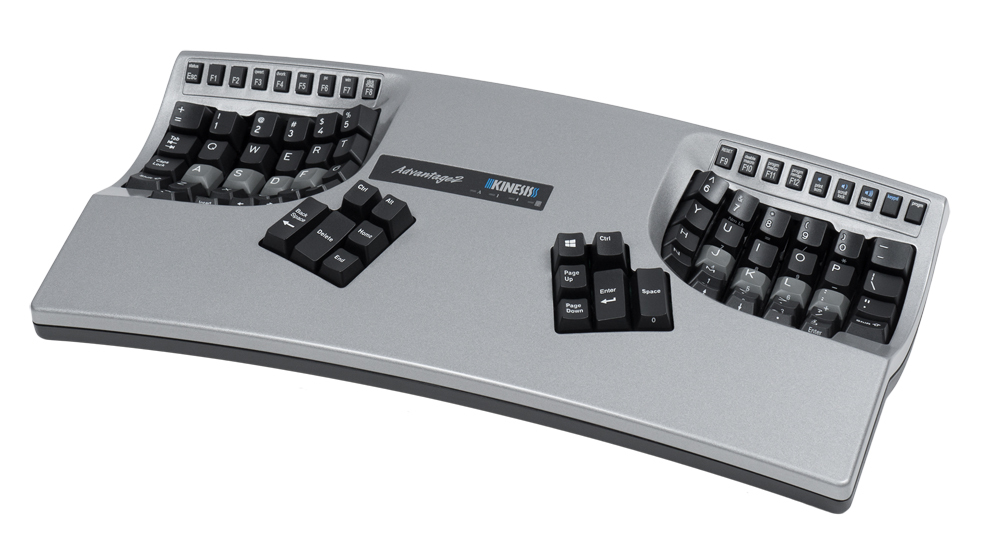
Kinesis Advantage 2
✓ Keeps your hands close to shoulder-width apart
✓ Maintains a handshake position
✓ Pairs your strongest muscles
(your thumbs) with the most common keys

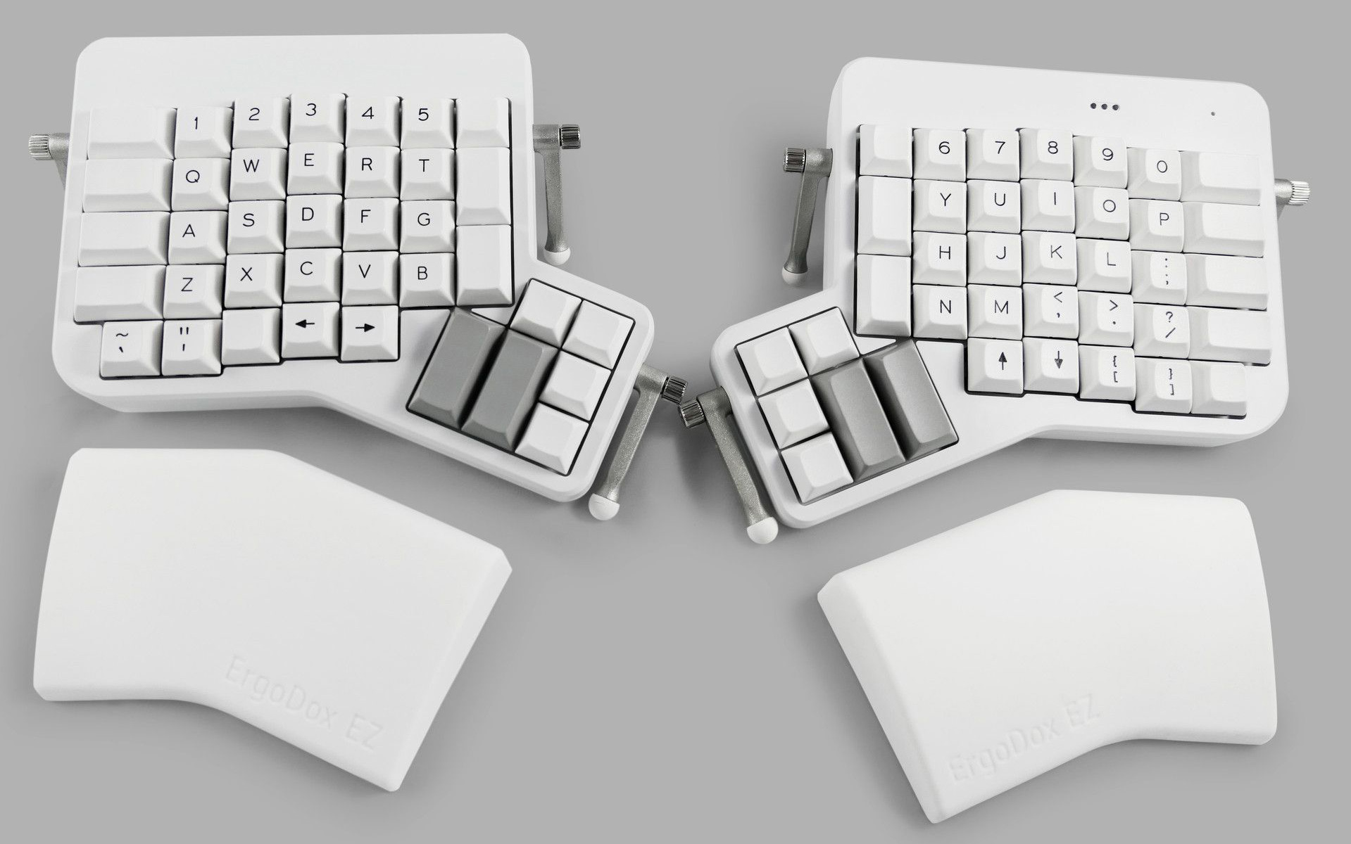
ErgoDox EZ
✓ Lets you place your hands as wide apart as you’d like
✓ Supports tenting and negative tilt through its adjustable legs
✓ Pairs your strongest muscles with the most common keys

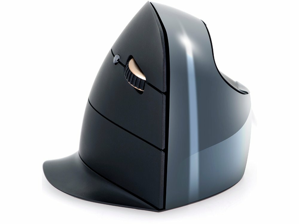
Evoluent VerticalMouse
✓ Maintains a handshake position
✓ Comes in wired and wireless versions
✓ Look, it’s a mouse—how many bullet points do you need?

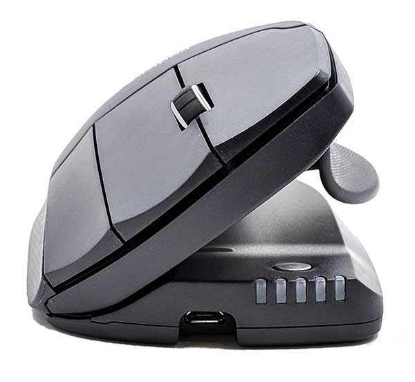
Contour Unimouse
✓ Maintains a handshake position
✓ Lets you adjust the tilt to your liking
✓ Comes in wired and wireless versions

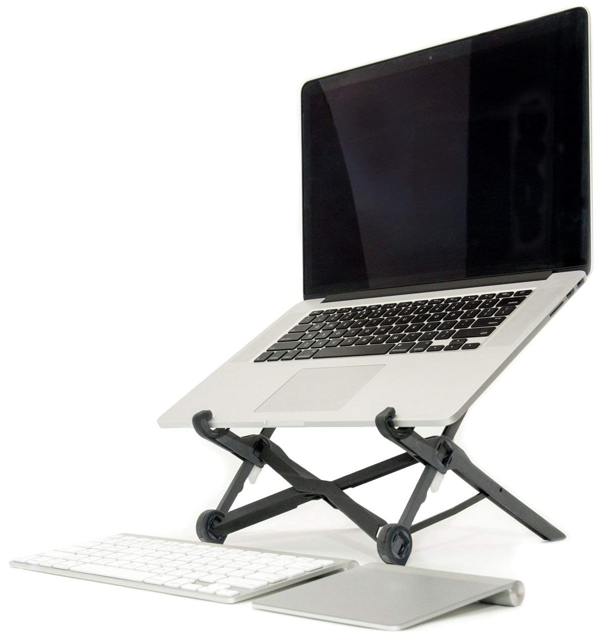
Roost Laptop Stand
✓ Places your laptop’s screen
at eye level
✓ Lets you adjust the height
to your liking
✓ Collapses for travel

The Kinesis Advantage 2 goes for about $300, as does the ErgoDox EZ.
And I know that ain’t cheap.
On top of that, you might be saying to yourself,
“Do I really need to worry about all this? I feel fine.”
Think of it this way—
How would you feel if you met a 30- or 40- or 50-year-old copy editor who smoked a pack a day and who said to you,
“Do I really need to worry about this? I feel fine.”
I mean, we’ve all heard of that one guy who smoked
a pack a day and lived to a hundred.
But that one guy’s story doesn’t mean that smoking a pack a day is harmless.
You might likewise know older copy editors who haven’t done a lick of ergonomic planning but who can type without issues.
But their good fortune doesn’t mean that we’re all going to be that lucky.
At the end of the day, ask yourself this:
“How much is it worth to me to be able to continue typing for a living?”
Recap—
- Keep your forearms and thighs parallel to the floor.
- Type with your hands at least 6–9 inches apart.
- Use a keyboard and mouse that let you maintain a handshake position.
- Place your monitor so that the top of the screen is 2–3 inches above eye level.
- Don’t use wrist rests—if anything, use palm rests.
@FriendlyAshley


